studio Z · Mobile APP · 1 month · 2020 · selected archive work
Redesigning an App that was
Once Ghosted
Redesigning an App that was
Once Ghosted
Redesigning an App that was Once
Ghosted
18%
New User Activation
15%
Reduced Bounce Rate
client
HILGROW - B2B/B2C SaaS
role
lead UI/UX designer
timeline
june 2020
tools
sketch · invision · airtable · pop
sketch · invision · miro
project overview
Band Studio is a mobile app featured on the Apple App Store and Google Play developed by Hilgrow, an agency that delivers engaging and result-oriented digital products. The mobile app allows users to simultaneously record live band sessions with their friends, edit separate tracks, and enjoy a full mix playback. In collaboration with Hilgrow, I conducted a usability test to improve user onboarding and increase user engagement by providing design recommendations.
Band Studio is a mobile app featured on the Apple App Store and Google Play developed by Hilgrow, an agency that delivers engaging and result-oriented digital products. The mobile app allows users to simultaneously record live band sessions with their friends, edit separate tracks, and enjoy a full mix playback. In collaboration with Hilgrow, I conducted a usability test to improve user onboarding and increase user engagement by providing design recommendations.
the challenge
When an app’s design is not intuitive, the product gets ghosted by the user. Research proves that the user will disengage and abandon a mobile app if the design and function cannot be understood. The goal was to revise the current design to allow users to be fully on-boarded by comprehending the app's functionality.
When an app’s design is not intuitive, the product gets ghosted by the user. Research proves that the user will disengage and abandon a mobile app if the design and function cannot be understood. The goal was to revise the current design to allow users to be fully on-boarded by comprehending the app's functionality.
voices from research
"I should not have to find things by accident.”"
"I should not have to find things by accident.”"
user participant · primary research
phase 01 · research
An app that users couldn't learn.
An app that users couldn't learn.
I started with a heuristic analysis to pinpoint usability problems in the interface. I then ran remote usability tests, asking participants to complete a series of tasks on the live mobile app, uncovering the moments where the design and the user's mental model fell out of sync.
I started with a heuristic analysis to pinpoint usability problems in the interface. I then ran remote usability tests, asking participants to complete a series of tasks on the live mobile app, uncovering the moments where the design and the user's mental model fell out of sync.
heuristic analysis
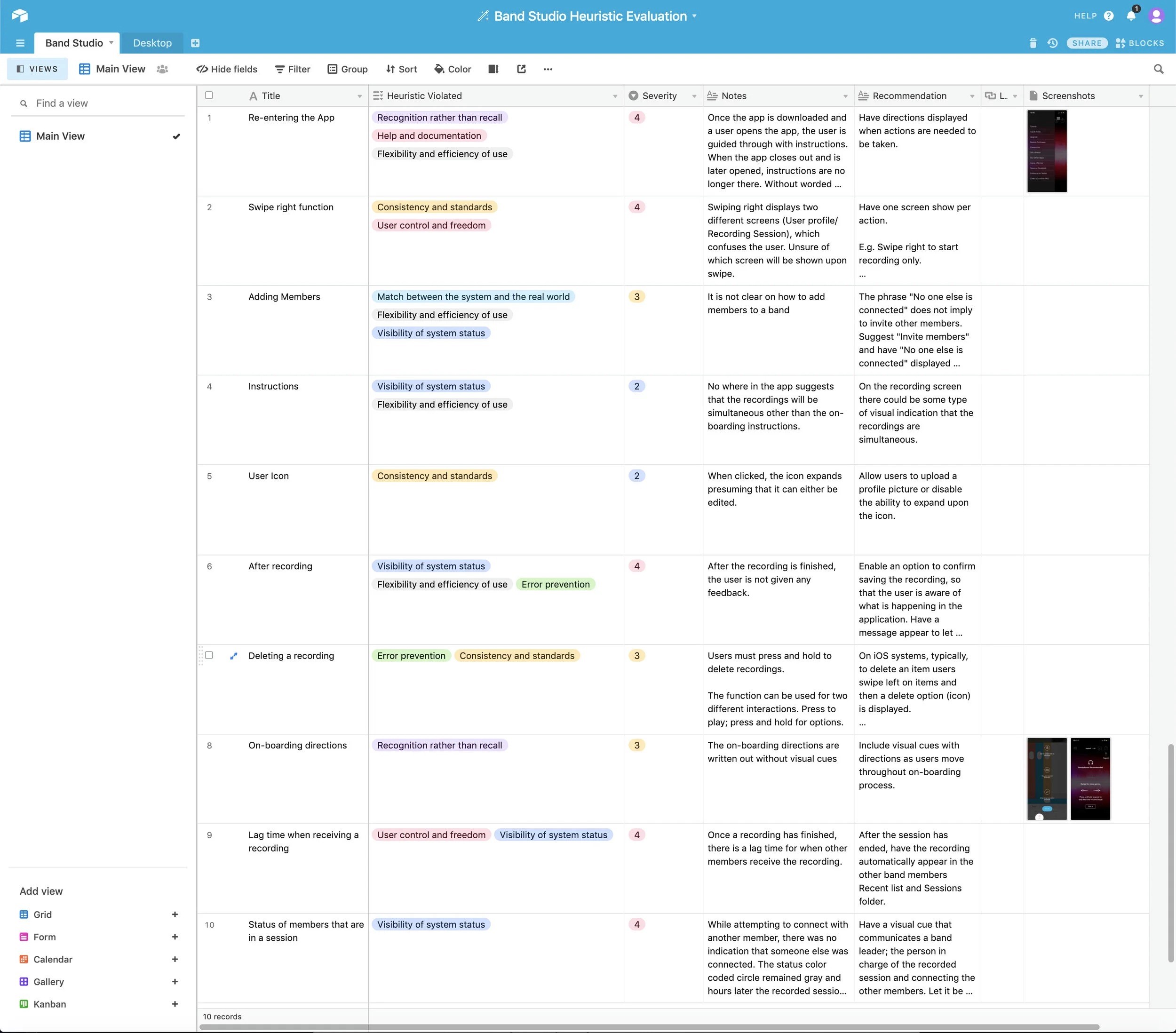
Where the interface broke down.
Where the interface broke down.
— Navigation between primary screens lacked clear hierarchy and consistency.
— Navigation between primary screens lacked clear hierarchy and consistency.
— Critical actions (recording, inviting band members, applying effects) were buried behind unclear gestures.
— Critical actions (recording, inviting band members, applying effects) were buried behind unclear gestures.
— No system feedback after task completion left users guessing whether anything had happened.
— No system feedback after task completion left users guessing whether anything had happened.
— Visual design lacked the engagement cues users expect from creative tools.
— Visual design lacked the engagement cues users expect from creative tools.
remote usability tests
What users actually showed us.
What users actually showed us.
— Users found it difficult to navigate between screens, invite band members, and locate effects.
— Users found it difficult to navigate between screens, invite band members, and locate effects.
— Users were confused by gestures, unclear on guidance, and unsure if a session was active.
— Users were confused by gestures, unclear on guidance, and unsure if a session was active.
— Users felt disengaged and assumed text fields and recording locations behaved differently than they did.
— Users felt disengaged and assumed text fields and recording locations behaved differently than they did.
— The app crashed multiple times during testing, eroding trust on top of the existing usability issues.
— The app crashed multiple times during testing, eroding trust on top of the existing usability issues.
phase 02 · synthesis
After multiple test sessions, two clear themes stood out.
After multiple test sessions, two clear themes stood out.
Synthesizing the heuristic findings and remote tests, the issues clustered into a list of usability problems and a parallel list of design recommendations to address them. Together, they framed the brief for everything that came after.
Synthesizing the heuristic findings and remote tests, the issues clustered into a list of usability problems and a parallel list of design recommendations to address them. Together, they framed the brief for everything that came after.
major findings
Where users got stuck.
— Difficult to navigate between screens.
— Difficult to navigate between screens.
— Difficult to invite band members.
— Difficult to invite band members.
— Confused and unclear on guidance.
— Confused and unclear on guidance.
— No adequate feedback after task completion.
— No adequate feedback after task completion.
— Users felt visually disengaged.
— Users felt visually disengaged.
— Unsure if anyone was connected to their recording session.
— Unsure if anyone was connected to their recording session.
— Unaware of which fields were tappable text inputs.
— Unaware of which fields were tappable text inputs.
— App crashed multiple times during testing.
— App crashed multiple times during testing.
— App gestures felt confusing and inconsistent.
— App gestures felt confusing and inconsistent.
— Hard time locating how to apply an effect.
— Hard time locating how to apply an effect.
— Assumed users could record from different locations simultaneously.
— Assumed users could record from different locations simultaneously.
key recommendations
What the redesign needed to do.
— Create a navigation experience that lets users move seamlessly throughout the app.
— Create a navigation experience that lets users move seamlessly throughout the app.
— Provide feedback to users as soon as a task is completed.
— Provide feedback to users as soon as a task is completed.
— Enhance visuals to keep users engaged.
— Enhance visuals to keep users engaged.
— Make text fields obvious.
— Make text fields obvious.
— Provide informational onboarding screens for first-time users.
— Provide informational onboarding screens for first-time users.
— Improve gestures and visual cues across critical actions.
— Improve gestures and visual cues across critical actions.
— Fix technical bugs surfaced during testing.
— Fix technical bugs surfaced during testing.
key screens highlighted
Current Onboarding, Recording, and Library, plus a new set of informational onboarding screens to be added.
Current Onboarding, Recording, and Library, plus a new set of informational onboarding screens to be added.
phase 03 · mapping
Re-mapping the journey, screen by screen.
Re-mapping the journey, screen by screen.
Once the recommendations were settled, I mapped the user journey to address the most pervasive issue from testing, moving between screens. The map became the backbone for the redesign's overall flow and screen order.
Once the recommendations were settled, I mapped the user journey to address the most pervasive issue from testing, moving between screens. The map became the backbone for the redesign's overall flow and screen order.

fig. 01 · band studio user journey · onboarding to repeat-use
the solution
A seamless onboarding process for new users — and a tighter pass over the screens that mattered most.
A seamless onboarding process for new users — and a tighter pass over the screens that mattered most.
phase 04 · design & test I — initial sketches
Sketching for control, feedback, and visual engagement.
Sketching for control, feedback, and visual engagement.
Throughout testing, users needed to feel a sense of control and to know what was being communicated through the interface. They also needed to feel visually engaged. The first round of sketches translated those needs into screen ideas.
Throughout testing, users needed to feel a sense of control and to know what was being communicated through the interface. They also needed to feel visually engaged. The first round of sketches translated those needs into screen ideas.
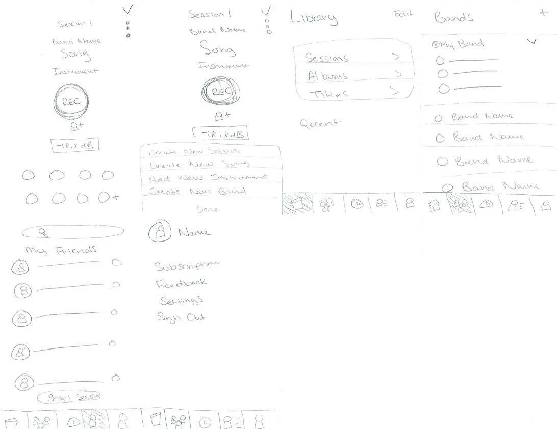
fig. 02 · initial sketches for the redesign
phase 05 · refined sketches
Building the UI elements that the high-fidelity prototypes would need.
Building the UI elements that the high-fidelity prototypes would need.
Next, I refined the initial sketches into screens that resolved the key findings, visible system feedback, clearer navigation, obvious text fields, and a first-time onboarding flow. These refined frames became the source material for the high-fidelity prototype.
Next, I refined the initial sketches into screens that resolved the key findings, visible system feedback, clearer navigation, obvious text fields, and a first-time onboarding flow. These refined frames became the source material for the high-fidelity prototype.

fig. 03 · refined sketches
from sketches · what carried forward
Three patterns carried through into the prototype.
Three patterns carried through into the prototype.
A consistent navigation shell across primary screens, an explicit confirmation pattern after each task, and a guided informational onboarding sequence for first-time users; these three patterns carried directly from refined sketches into the high-fidelity build.
A consistent navigation shell across primary screens, an explicit confirmation pattern after each task, and a guided informational onboarding sequence for first-time users; these three patterns carried directly from refined sketches into the high-fidelity build.
phase 06 · before
Band Studio's current screens, the starting point.
Band Studio's current screens, the starting point.
Before showing the redesigned screens, here are the live versions used in testing, including onboarding, recording, and library flows that surfaced the friction described in earlier sections.
Before showing the redesigned screens, here are the live versions used in testing, including onboarding, recording, and library flows that surfaced the friction described in earlier sections.
fig. 04 · band studio current screens
phase 07 · after
The redesigned screens, end to end.
The redesigned screens, end to end.
High-fidelity screens covering the redesigned onboarding sequence, the revised recording and library flows, and the supporting feedback states surfaced by the earlier tests. Built to be straightforward and intuitive, not just functionally correct.
High-fidelity screens covering the redesigned onboarding sequence, the revised recording and library flows, and the supporting feedback states surfaced by the earlier tests. Built to be straightforward and intuitive, not just functionally correct.

fig. 05 · band studio redesigned screens
design solution · the brief, in one line
Create a seamless onboarding process for new users and revise the critical screens.
The redesign focused on two outcomes the research had pointed at directly: a guided onboarding sequence so first-time users could understand the app's purpose before being dropped into it, and a tightened pass over the screens that produced the most friction during testing, recording, library, and the entry points around them.
The redesign focused on two outcomes the research had pointed at directly: a guided onboarding sequence so first-time users could understand the app's purpose before being dropped into it, and a tightened pass over the screens that produced the most friction during testing, recording, library, and the entry points around them.
conclusion · what the project gave me
Interaction is what turns a download into a return visit.
Interaction is what turns a download into a return visit.
This project taught me how much weight design interaction carries in whether an app survives its first session. Users won't stay if they can't feel confident interacting with the interface, can't tell what the app is for, or can't learn it without effort. The interface has to be learnable, with reasonable feedback and response time. Without those, users abandon the product and engagement drops sharply.
This project taught me how much weight design interaction carries in whether an app survives its first session. Users won't stay if they can't feel confident interacting with the interface, can't tell what the app is for, or can't learn it without effort. The interface has to be learnable, with reasonable feedback and response time. Without those, users abandon the product and engagement drops sharply.
key takeaway 01
Confidence comes from feedback.
Confidence comes from feedback.
Users need to know that what they did worked. Without acknowledgment after each interaction, even a well-built app feels broken.
Users need to know that what they did worked. Without acknowledgment after each interaction, even a well-built app feels broken.
key takeaway 02
Unfamiliar apps require explicit onboarding.
Unfamiliar apps require explicit onboarding.
For products with novel interaction patterns, onboarding isn't a polish layer — it's the difference between a user who learns the app and one who deletes it.
For products with novel interaction patterns, onboarding isn't a polish layer — it's the difference between a user who learns the app and one who deletes it.
next steps · what would follow
Implement, then test again.
Implement, then test again.
The next phase of work would be to implement the design recommendations and then run a fresh round of usability testing — measuring whether the redesigned screens reduce the abandonment patterns the original tests surfaced.
The next phase of work would be to implement the design recommendations and then run a fresh round of usability testing — measuring whether the redesigned screens reduce the abandonment patterns the original tests surfaced.

annjalina.k
Senior UX/Product designer based in Maryland. Research, systems thinking, measurable outcomes.
colophon
built in framer
fraunces + inter + jetbrains mono
© 2016–2026 · all rights reserved
annjalina.k
Senior UX/Product designer based in Maryland. Research, systems thinking, measurable outcomes.
colophon
built in framer
fraunces + inter + jetbrains mono
© 2016–2026 · all rights reserved
annjalina.k
Senior UX/Product designer based in Maryland. Research, systems thinking, measurable outcomes.
colophon
built in Framer
set in Fraunces & Inter
© 2016–2026 · all rights reserved