← back to work

case study · 05 of 05

studio Z · e-commerce · 7 months · 2019 · selected archive work

studio Z · e-commerce · 7 months · 2019 · selected archive work

Designing for the Moment the Shelf Is Empty.

Designing for the Moment the Shelf Is Empty.

Designing for the Moment the Shelf Is Empty.

+3%

Checkout Completion

-5%

Checkout Abandonment

15%

OPT-IN Adoption

-7%

Bounce Rate

client

e-commerce · studio z

role

lead UI/UX designer

timeline

apr–nov 2019

tools

sketch · invision · miro · pop

sketch · invision · miro

project overview

Studio Z sells furniture and home goods through a digital platform carrying 22 million items from 13,200 suppliers. The brief: restructure the mobile retail experience so shoppers could buy from partnered brands and customize the site to their needs.

Studio Z sells furniture and home goods through a digital platform carrying 22 million items from 13,200 suppliers. The brief: restructure the mobile retail experience so shoppers could buy from partnered brands and customize the site to their needs.

the challenge

When a product is out of stock, everybody loses. Research shows shoppers either substitute the item, usually from another retailer, or leave the site entirely. The goal was to design a mobile experience that reduced the frequency of OOS encounters, and softened the sting of the ones we couldn't prevent.

When a product is out of stock, everybody loses. Research shows shoppers either substitute the item, usually from another retailer, or leave the site entirely. The goal was to design a mobile experience that reduced the frequency of OOS encounters, and softened the sting of the ones we couldn't prevent.

voices from research

"It would be nice if they could say expected in xyz amount
of days, or provide alternative solutions."

"It would be nice if they could say expected in xyz amount
of days, or provide alternative solutions."

interview participant · primary research

phase 01 · research

Behind the stat: a $17 billion loss, and one consistent customer feeling; annoyed.

Behind the stat: a $17 billion loss, and one consistent customer feeling; annoyed.

Secondary research framed the scale of the OOS problem. Primary research, surveys and interviews told me what it actually felt like to be on the receiving end of an out-of-stock.

Secondary research framed the scale of the OOS problem. Primary research, surveys and interviews told me what it actually felt like to be on the receiving end of an out-of-stock.

secondary research

What the industry already knew.

What the industry already knew.

— Consumers are more likely to research a product online and make a purchase than research online and buy in-store.

— Consumers are more likely to research a product online and make a purchase than research online and buy in-store.

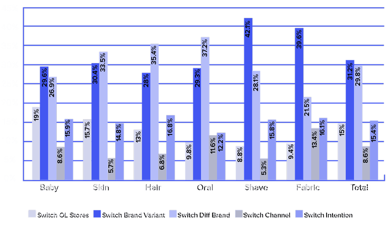
— Online OOS rates are nearly twice as high as in-store availability, contributing up to $17 billion in lost online sales globally each year.

— Online OOS rates are nearly twice as high as in-store availability, contributing up to $17 billion in lost online sales globally each year.

— The most frequent response to an OOS encounter is substitution — usually within the same brand at another online store.

— The most frequent response to an OOS encounter is substitution — usually within the same brand at another online store.

— 88% of consumers pre-research products online before making a purchase.

— 88% of consumers pre-research products online before making a purchase.

primary research

What users actually said.

What users actually said.

— Shoppers prefer online because of time convenience and the manageable display of product information.

— Shoppers prefer online because of time convenience and the manageable display of product information.

— OOS creates a state of inconvenience, so most shoppers substitute with something else, often elsewhere.

— OOS creates a state of inconvenience, so most shoppers substitute with something else, often elsewhere.

— Lack of product availability makes most shoppers feel actively annoyed or aggravated.

— Lack of product availability makes most shoppers feel actively annoyed or aggravated.

— No restock updates = a communication gap between retailer and customer that quietly erodes loyalty.

— No restock updates = a communication gap between retailer and customer that quietly erodes loyalty.

phase 02 · personas

Two shoppers, one shared frustration.

Two shoppers, one shared frustration.

The research surfaced two distinct but overlapping niches of online shoppers and each came to Studio Z for different reasons, but hit the same wall at the same moment: the out-of-stock page.

phase 03 · ideation

From the research, a story. From the story, sketches.

From the research, a story. From the story, sketches.

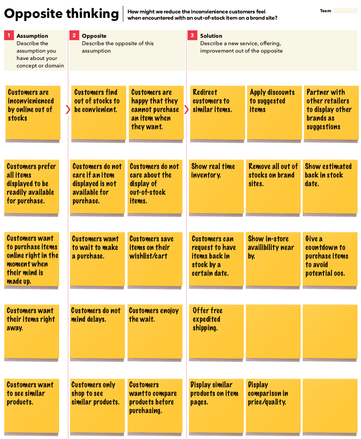
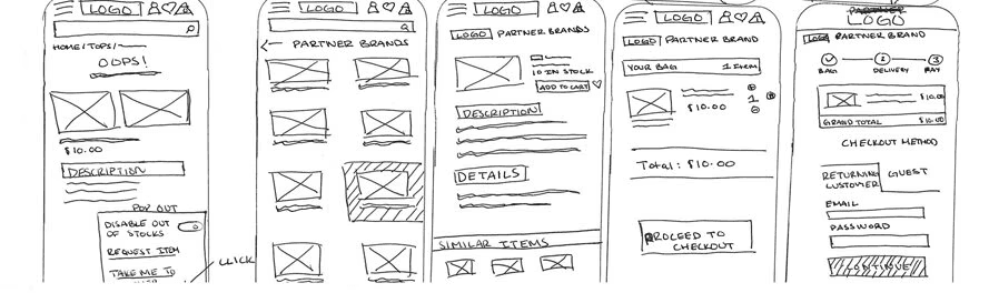
With the personas and insights in hand, I turned the problem inside out, using opposite thinking to surface unconventional directions, then translated the strongest ideas into early sketches for two distinct solution tracks.

With the personas and insights in hand, I turned the problem inside out, using opposite thinking to surface unconventional directions, then translated the strongest ideas into early sketches for two distinct solution tracks.

opposite thinking exercise

Reversing the problem to find unexpected angles. If we wanted more OOS pain, what would we do? Then invert every answer into a design constraint.

Reversing the problem to find unexpected angles. If we wanted more OOS pain, what would we do? Then invert every answer into a design constraint.

initial sketches · 02 tracks

Purchase from partnered brands.

Purchase from partnered brands.
Initial-sketches pbrands.jpg

Mobile customization.

Mobile customization.

the solution

A seamless shopping experience that lessens the frequency
of out-of-stock encounters and when they happen, replaces the dead-end with tailored alternatives, partnered-brand purchases, and site customizations users can trust.

A seamless shopping experience that lessens the frequency
of out-of-stock encounters and when they happen, replaces the dead-end with tailored alternatives, partnered-brand purchases, and site customizations users can trust.

phase 04 · storyboarding

Mapping the emotional arc before the pixels.

Mapping the emotional arc before the pixels.

A shopper's journey through OOS isn't really about the product, it's about how they feel at each step. Storyboarding helped frame where to intervene, and where transparency mattered most.

A shopper's journey through OOS isn't really about the product, it's about how they feel at each step. Storyboarding helped frame where to intervene, and where transparency mattered most.

fig. 03 · shopper journey storyboard

phase 05 · design & test I

The most important insight: give users reliability, assurance, and alternatives.

The most important insight: give users reliability, assurance, and alternatives.

When users hit an OOS, they need to feel a sense of self-gratification, assurance from the retailer that they can still make a reliable purchase. The first round of design focused on two tracks: partnered brands, and mobile customization.

track 01 · purchase from partnered brands

track 01 · purchase from partnered
brands

Home.jpg
Home.jpg
Partnered Brands.jpg
Apply Filter.jpg
Apply Filter.jpg
Confirmation.jpg
Confirmation.jpg

track 02 · mobile site customization

user test I · what we learned

In-person guerilla usability tests revealed one important simplification.

In-person guerilla usability tests revealed one important simplification.

Once a user was directed to a partnered brand item and hit “buy now,” there was no need for a redundant product description page because they had already seen everything they needed. We removed the extra step.

phase 06 · wireflows

From rough sketches to documented flows.

From rough sketches to documented flows.

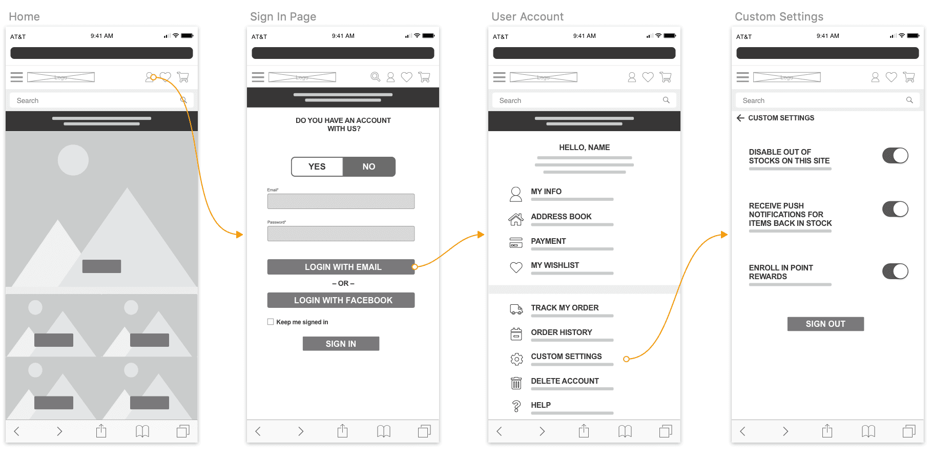
Each track got a detailed wireflow, mapping every screen, state, and transition the user would touch. This is where the design stopped being an idea and started becoming a build-ready spec.

wireflow · purchase from partnered brands

wireflow · mobile customization
phase 07 · design & test II

High-fidelity prototypes, moderated usability tests, a tighter design.

High-fidelity prototypes, moderated usability tests, a tighter design.

With the flows validated, I developed high-fidelity prototypes and ran moderated usability sessions to ensure the final design was straightforward and intuitive, not just functionally correct.

fig. 04 · partnered brand purchase prototype

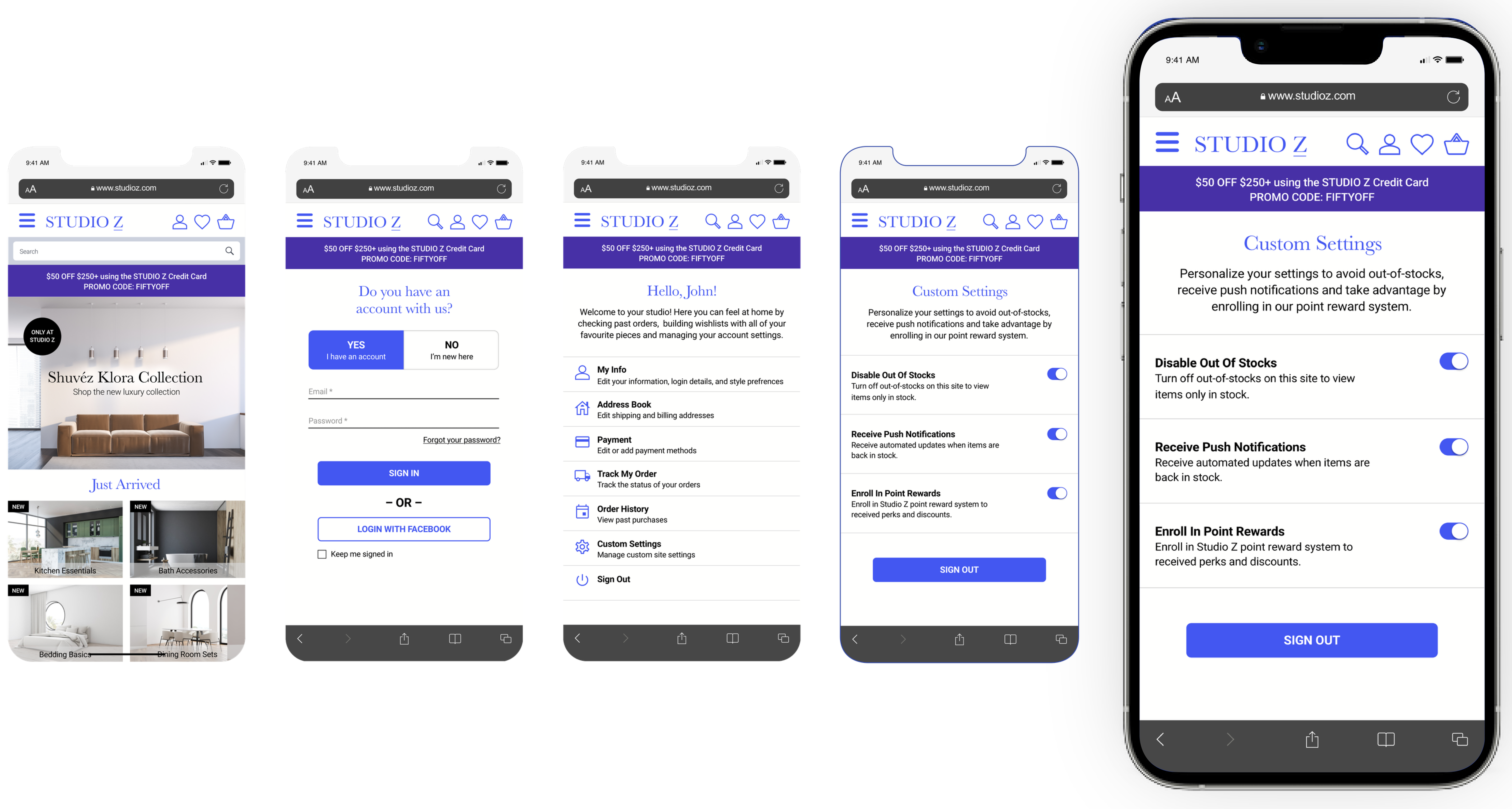
MVP - Purchase from Partnered Brands

MVP - Purchase from Partnered Brands

fig. 05 · full mobile
customization flow

MVP - Mobile Site Customization

MVP - Mobile Site Customization

user test II · what we learned

Small label, big preference.

On the account sign-in page, users preferred a regular button label presented with the action "Sign In" instead of "Login with Email." A one-word change, but a real user signal and the button label was updated to match the preference.

conclusion · what the project gave me

A craft project that became the foundation of an ongoing research practice.

A craft project that became the foundation of an ongoing research practice.

This project was genuinely fun, and it let me explore a lot of creative ideas. More than the deliverable, it's where I built the research and storyboarding that I continue to draw from in later work.

This project was genuinely fun, and it let me explore a lot of creative ideas. More than the deliverable, it's where I built the research and storyboarding that I continue to draw from in later work.

key takeaway 01

Alternatives lower irritability.

Alternatives lower irritability.

When shoppers hit an unfortunate circumstance on a retail mobile site, offering meaningful alternatives measurably reduces frustration.

When shoppers hit an unfortunate circumstance on a retail mobile site, offering meaningful alternatives measurably reduces frustration.

key takeaway 02

In-site alternatives beat cross-site searches.

In-site alternatives beat cross-site searches.

Suggesting alternatives in-context cuts the time a user would otherwise spend re-searching the item on another brand's site and keeps them on yours.

Suggesting alternatives in-context cuts the time a user would otherwise spend re-searching the item on another brand's site and keeps them on yours.

key takeaway 03

Emotional tone is a design decision.

Emotional tone is a design decision.

Emotional affect plays a critical role in site design and the overall tone of transparent communication. How you say "sorry, it's gone" is as important as what you offer next.

Emotional affect plays a critical role in site design and the overall tone of transparent communication. How you say "sorry, it's gone" is as important as what you offer next.

Annjalina K. logo

annjalina.k

Senior UX/Product designer based in Maryland. Research, systems thinking, measurable outcomes.

colophon

built in framer

fraunces + inter + jetbrains mono

© 2016–2026 · all rights reserved

Annjalina K. logo

annjalina.k

Senior UX/Product designer based in Maryland. Research, systems thinking, measurable outcomes.

colophon

built in framer

fraunces + inter + jetbrains mono

© 2016–2026 · all rights reserved

Annjalina K. logo

annjalina.k

Senior UX/Product designer based in Maryland. Research, systems thinking, measurable outcomes.

portfolio

resume

colophon

built in Framer

set in Fraunces & Inter

© 2016–2026 · all rights reserved