
Boosting Engagement and Workflow Efficiency Through Enhanced Feature Visibility
Boosting Engagement and Workflow Efficiency Through Enhanced Feature Visibility
A research driven enhancement that lifted task completions by 20%
Modernizing a Legacy AngularJS Platform into an Accessible React System,
Driving 40% Efficiency Gains
+20%
Task Completions
+15 Points
CSAT
+20%
Task Completions
+15 Points
+15 Points
CSAT
CLIENT
Government Agency
Government Agency
PROJECT TYPE
End-to-end, Usability Testing
End-to-end, Usability Testing
TIMELINE
1 month
1 month
TEAM SIZE
3
3
ROLE
UX Designer
UX Designer
DESIGN TOOLS
Figma, Mural, Matomo
Figma, Mural, Matomo
STRATEGY
Research
UX Outcomes
UI Design
Accessibility
PROJECT OVERVIEW
PROJECT OVERVIEW
When I joined the team, a notification center feature had been previously implemented for 1 year. To assess its performance, we analyzed its data in Matomo and SQL queries which revealed low user engagement. To better understand users' sentiment around the Notification Center, we conducted a survey and held usability sessions where we uncovered critical areas for improvement such as feature visibility and user engagement.
THE CHALLENGE
THE CHALLENGE
Making notifications more visible posed a great challenge. Our team knew that if we made everything prominent, we would run the risk of exposing low-value or irrelevant alerts, which erodes trust. Users already had the perception of a cluttered notification center and increasing its prominence could make the interface feel more overwhelming.
THE PROBLEM STATEMENT
THE PROBLEM STATEMENT
As a designer, I would like to increase user engagement of the notification center.
"I didn’t know about the notification center until now."
"I didn’t know about the notification center until now."
User
Key Usability Findings of Users Surveyed
52%
38%
70%
Viewed their notifications through email
Are aware of the notification center and never used it
Did not find the notification center helpful
50%
62%
82%
Felt that there were too many notifications
Unaware that the notification center existed
Couldn't access the notification center
through email
Key Insights
Key Learnings that Shaped UX
Discovery Sets the Foundation to Success
Discovery ensures the team fully understand the legacy functionality, technical restraints, and user flows before the migration.
A Well Defined Phased Approach Works
Setting clear goals and timelines helps keep everyone on track.
Collaboration Accelerates Adoption
Engaging all stakeholders early on was imperative for success.
What's Next
Expanding the Design System
Extend the library components across 5 additional products.
Usability Testing
Conduct usability testing on new components to refine interaction patterns.
Having centralized styling with CSS variables has made testing significantly better. Updates are predictable and we are no longer firefighting styling issues every release. Our QA team can focus on validating real functionality.
Quality Impact
-QA Lead
KEY ACHIEVEMENTS
Beyond the metrics, we established a scalable design foundation that enables more consistent user experiences and faster product development.
Migrated 60+ components and patterns
Reduced Technical Debt by 40%
Achieved 100% feature parity during
transition
Improved page load speeds by 3x
Established a design system for future growth
Established design system used across
5 products
WHAT NEEDS TO BE FIXED
Synthesizing data revealed patterns and trends that highlighted opportunities for UX improvements.
UX Improvement Opportunities
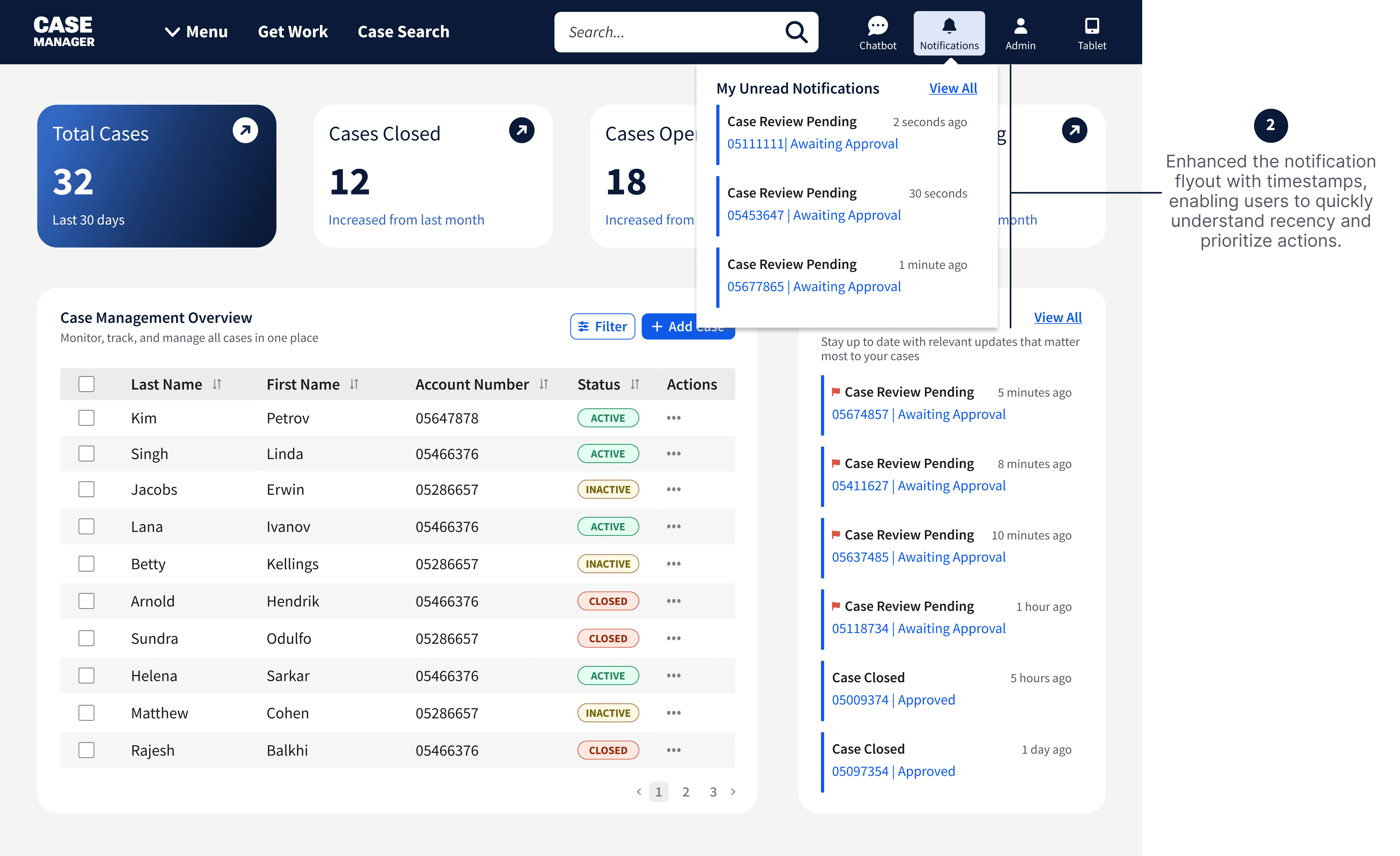
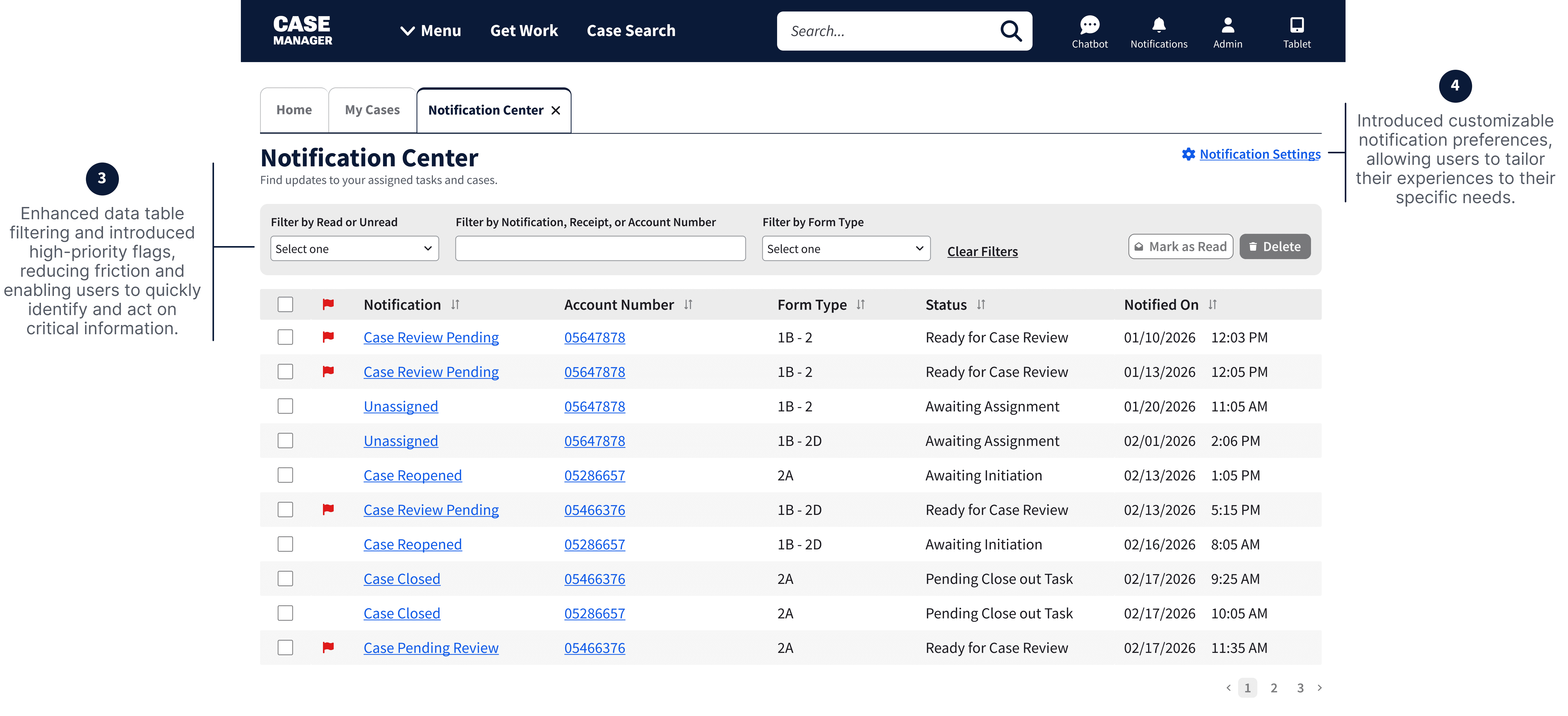
Notification Clutter: The opt-in promised visibility, but delivered an unfiltered flood of notifications users weren't prepared for.
Communication and Feedback: No clear hierarchy between urgent and informational alerts.
Email Disconnect: Users weren't being brought back into the product through email notifications effectively.
Visibility: The notification center existed but users weren't finding it, discoverability was a core problem.
Engagement: Users may not have understood what the notification center was for or why it mattered.


THE PROCESS: Our Four-Phased That Shaped Success
By following a four-phase migration strategy, we modernized our platform from AngularJS to React without disrupting development momentum.
Conduct Survey & Synthesize Data
Synthesize data by highlighting trends and patterns
Prioritize recommendations based on impact and technical feasibility
Get Buy-In
Meet with stakeholders and provide feasible
recommendations thataligns with business and
user needs.
Design & Test
Brainstorm and iterate on designs options
Conduct moderated usability sessions to
validate design solution
Implement
Handoff to engineers
IDEATION WORKSHOP


THE PROCESS: The Strategy that Moved the Needle
Conduct Survey & Synthesize Data
Synthesize data by
highlighting trends and
patterns
Prioritize recommendations
based on impact and technical
feasibility
Synthesize data by
highlighting trends and
patterns
Prioritize recommendations
based on impact and technical feasibility
User Journey Maps
Technical Assessment
Accessibility Audit
What We Found
90+ Accessibility risks
20+ Outdated user workflows
Get Buy-In
Get Buy-In
Meet with stakeholders
and provide feasible
recommendations that
aligns with business
and user needs.
Meet with stakeholders
and provide feasible
recommendations that
aligns with business
and user needs.
Design and Test
Brainstorm and iterate on
designs options
Conduct moderated
usability sessions to
validate design solution
Implement
Handoff to engineers
Design & Test
Brainstorm and iterate on
designs options
Conduct moderated
usability sessions to
validate design solution
Implement
Handoff to engineers
IDEATION WORKSHOP
Key Usability Findings of Users Surveyed
52%
52%
38%
38%
70%
70%
Viewed their notifications through email
Viewed their notifications through email
Are aware of the notification center and never used it
Are aware of the notification center and never used it
Did not find the notification center helpful
Did not find the notification center helpful
50%
50%
62%
62%
82%
82%
Felt that there were too many notifications
Felt that there were too many notifications
Unaware that the notification center existed
Unaware that the notification center existed
Couldn't access the notification center through email
Couldn't access the notification center
through email
WHAT NEEDS TO BE FIXED
Synthesizing data revealed patterns and trends that highlighted opportunities for UX improvements.
UX Improvement Opportunities
Notification Clutter: The opt-in promised visibility, but delivered an unfiltered flood of notifications users weren't prepared for.
Notification Clutter: The opt-in promised visibility, but delivered an unfiltered flood of notifications users weren't prepared for.
Communication and Feedback: No clear hierarchy between urgent and informational alerts.
Communication and Feedback: No clear hierarchy between urgent and informational alerts.
Email Disconnect: Users weren't being brought back into the product through email notifications effectively.
Email Disconnect: Users weren't being brought back into the product through email notifications effectively.
Visibility: The notification center existed but users weren't finding it, discoverability was a core problem.
Visibility: The notification center existed but users weren't finding it, discoverability was a core problem.
Engagement: Users may not have understood what the notification center was for or why it mattered.
Engagement: Users may not have understood what the notification center was for or why it mattered.

Having centralized styling with CSS variables has made testing significantly better. Updates are predictable and we are no longer firefighting styling issues every release. Our QA team can focus on validating real functionality.
Quality Impact
-QA Lead
KEY ACHIEVEMENTS
After the enhancement rollout, we measured performance and evaluated UX outcomes using Matomo Analytics, a feedback survey, and running SQL queries to evaluate if the notifications feature was being used as intended.
Here is what we found:
80% rely on notifications to plan their daily tasks
80% rely on notifications to plan their daily tasks
+40% notification open rate
+40% notification open rate
+20% task completion rate
+20% task completion rate
+45% notification opt-in
+45% notification opt-in
+15 points on CSAT
+15 points on CSAT
+45% notification center visits
+45% notification center visits
KEY INSIGHTS: Key Learnings that shaped uX
Design for Value, Not Discoverability
Increasing visibility is necessary, but not sufficient. Relevance and timing matters more.
Discovery Sets the Foundation to Success
Discovery ensures the team fully understand the legacy functionality, technical restraints, and user flows before the migration.
User Control Builds Trust
Giving users the ability to customize notifications increases satisfaction
Data and User Feedback Tells the Full Story
Analytics shows what users were doing and surveys revealed why
Quicker Developer Onboarding
Created Single Source of Truth,
Reduced feature specific UI rebuilds